Tuesday, August 30, 2011

Jolin, Tellenta, and Mangala Solaris

So, this post is a combination of a new piece and discussion of two older ones that I forgot to post up although I did put them in the galleries.

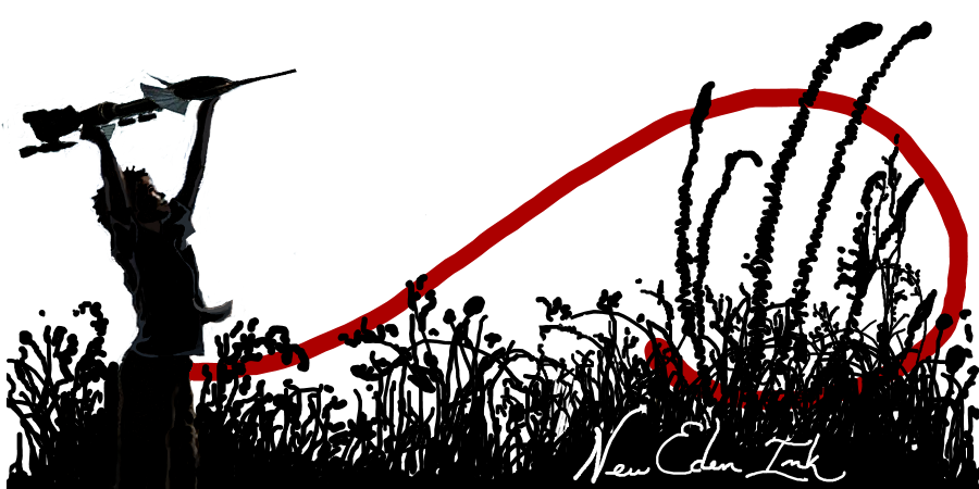
The oldest one that I forgot to post about was Mangala Solaris.  He was inspired by my piece with the kids playing with the spaceships at the beach (the little girl in that one is actually me when I was itty bitty! haha).  I did a similar one for him, except with a boy playing with a firetail and a comet.  Getting to rainbow-color the text was fun, and helped add to the youthful theme.  I didn't want anything to serious in this one.


The other piece I forgot to post about was Tellenta's.  This one was supposed to be a cartoonish picture where the character realizes that mining ops are just as fun as o.o sov warfare.  I tried to blend the cartoon style with some other typically 'me' elements (e.g. feathered colorful sky).


Lastly we have the most recent sig I completed, which I will admit is something I considered not doing at all.  This was a piece for "The Babe Thread" on FHC, and being female myself, it felt odd doing a signature like this where girls are so objectified.  However, in the end it was a piece that I figured would challenge me on my rather abysmal figure drawing skills.  I had to go back to some of my basic art anatomy books to practice before I even got started.  In the end, I looked at it like an art lesson for myself.


I've got several updates in the commission status page, and I'm simply waiting to hear back from those people to know if I'm on the right track for them or not. If I don't hear back soon, I'll be moving on down the list.  Lots of pieces are mid-progress and my goal is to get them to the point where I can get some feedback... so... hopefully more links and updates soon!

Tootles! o/

Friday, August 26, 2011

The second of a non-eve series

At long last, I've finished the second request from Cue1* - this one is a signature following the same paintball theme of the first.  I've been playing around with different brushes for the background, and settled on a more cross-hatched style for the sky rather than the feather-blended that I normally favor.  I also had a lot of fun with his name, which I tried to make look a bit like splattered paint (since the theme is 'paintball' lol).  The bright red is to balance the heavy imagery on the right, and then I also pulled out some more greens in this image (underbrush and jackets) to complement the red.  Like the first image, I tried to keep the color palette very dark with high contrast.  Since the image is supposed to be on a grey background, I threw it up in grey here, although (like all of my images) the background is actually transparent and hence will merely pick up the grey of whatever forums it ends up on.


Onwards to the next!  I've actually got lots of pieces partially completed, but nothing to the point where I'm ready to put up links for everyone.  I know it's very slow-going here, but I am steadily working through it all while trying not to rush any one piece.

Tootles! o/ 'till next time.

Also - if anyone has feedback or suggestions as to how to re-edit these images to improve them, I'm all ears.  Fonts are something I struggle a lot with as well - I have the style I normally write in, and it's hard to remember to break out from what comes naturally.  Anyways, comments/suggestions/criticisms are all welcome =)